As someone who went through this quite recently, I’ll share my experience with getting a cover designed for my books – what to know before you start and how may the process look like.
Book cover is one of the most important parts of the book, barring the story itself – and one of those very few writers can take care of themselves (at least on a decent level). Thus, it’s something most writers will have to outsource. Coming to this process prepared can save you time – and maybe sleepless nights as well.
What to know beforehand
As harsh as it may be, the first thing you should ask yourself is: how much are you willing to pay for it. US-based companies and best-of-the-best specialists may ask well over $1000 for a custom-made cover – and may be booked out months in advance. Freelancers can squish this number a lot, but the quality varies. Pre-made covers can go below $100 but you may not find something that fits your story… ever.
Also, keep in mind that price grows with the amount of characters and the complexity (single half-body character will cost way less than a warrior in armor).
Along with this, you should know there are pretty much three dominant ways to make a cover: photomanipulation, illustration (digital drawing), or a combination of both. The look and feel may differ a lot based on the method – and different method may fit different genres more.
You should definitely have a decent idea what do you want your cover to look like. Important aspect is to know what works for your genre – a cover that doesn’t convey the right idea to the readers may sink your book before it’s even launched – and cost you a lot in the long-term. Have a look at other self-published* books in your genre to help you determine whether your idea can work. Just as well, you should know that a cover will always require some degree of compromise: your idea may struggle with the reality in aspects such as clarity or contrast.
* Traditionally-published books tend to have very bland and meh covers because the publishers can throw a massive amount of marketing on them, more so if it’s a big name. This is, in my opinion, a poor grasp of the evolution caused by the existence of digital publishing but I won’t complain – let them use bland covers and leave the nice ones for self-pub authors.
Finding an artist
This could be a topic for itself, and the options will vary depending on your options and demands. You can use a platform like 99deisgns, which pretty much creates a contest: people will send you their take on the cover based on what information you provide and you then select the best (and can request edits in a limited time). Another option is to contact an artist directly via their webpage (if you know some – even if just from the cover of another author’s book) or use some freelancer platform (I used fiverr).
Either way, you need to express your idea as clearly as possible. In case of freelancers, one thing to keep in mind is in language skills: I’ve found many people offering what looked like a decent job but their English was very poor and I had doubts I would be able to well talk about the finer details of my ideas – so keep that in mind.

When you do contact someone, mention all you can: your vision of the cover, your timeframe (mine was quite generous at 3 months), your price limit (mine was around 300€), and anything else you may find useful as reference material (blurb/samples can help, as can hand-drawn sketches). And be ready to answer all and any questions they might have.
The process
Unless the artist has something useful from previous unfinished orders (such as mentioned competition), the early work will be done with simple sketches and concepts. I admit, this was a new experience for me – it was sometimes hard to imagine how the early concept will turn out at the end yet I had to make decisions based on them. The very first hurdle was describing the pose I imagined for the characters, and eventually I sacrificed two minutes to produce this in MSpaint as an example.
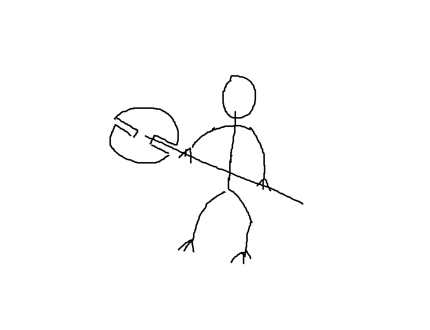
To my surprise, it helped us to move in the right direction and I got some further suggestions that eventually led me to reconsider the pose so it wouldn’t interfere as much with the second character. I will probably try to make some pencil sketch for the future covers – once I have an idea what I want it to look like, that is.

And when the pose for the characters was finalized, I had to choose the color scheme.

This was easier for me because I always saw the Eternal Defenders as someone who wouldn’t experiment with colorful approach to their garb.
The process may be very different in case of photomanipulation than in case of illustration. The final stage was then creating the background, which went through a few trials and errors, and shown that anything can be useful as a source material (my communication with the artist involved movie screenshots and other book covers as examples).
Something about details
It may happen to you that every step of the process will be a tough fight between two parts of you: one who would like to move on to the next stage even at the cost of larger inaccuracies, and one that would want to ask the artist for changing the smallest thing to make sure the characters look exactly as you imagine them.
And, as I said in the beginning, you have to find a compromise. Keep in mind there’s a person at the other side who is doing their best but each change takes time and effort to make. And keep in mind that most people will not see a full-size cover – at least not right away. Consider the size of previews on Amazon or Goodreads – they’re like the small photo on your ID/driver’s license.
A cover has one purpose only: to give a potential reader a clear idea about the story’s genre (or subgenre) and themes. If that resonates with the reader, they’ll read the blurb and hopefully buy your book, but they’ll eventually create their own mental picture of the world and characters as they read your story.

For example: the mage in my story has brown hair, and I originally wanted that to be visible – but the background’s color scheme would make it blend into it and so he wears a hood instead. Kraasian’s axe isn’t exactly as I imagine it – but that changes little on the message the cover is supposed to give. I’ve made several compromises and while a part of me would want to change a lot, the pragmatic half knows that the cover does convey the themes I want it to show, even if it’s not a precise image of my own fictional world.
Daniel M. Ford, author of the Paladin Trilogy (Goodreads link), was asked about the differences between cover and actual characters – and his answer was along the same lines: the point of a cover is to show the book’s themes. Considering the small preview image, that’s what matters the most. And I am glad to come across that question (and answer) before I dived into having my own cover designed and learning the hard way.
Personal conclusion
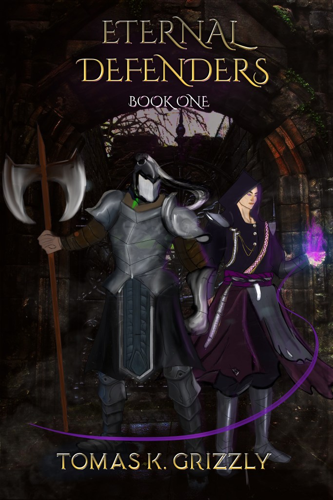
Are you curious about the differences in my particular case? First, the cover doesn’t show the typical elven ears on any characters as the helmet/hood are in the way. Likewise, Ereanel’s eyes have a subtle glow to them (of similar color as the magic effects) that wouldn’t be well visible either. Kraasian’s axe was shown above in my sketch, so that’s another part. Kraasian’s helmet has no ‘tail’ in the story. And my original idea was to have them stand at a simple wall (think the Great Chinese Wall) instead of a castle.
But this cover gives the message I wanted it to give: this warrior and mage are willing to defend their homeland against whatever comes at them.
Closing thoughts
I hope this post may give you some insight into the process and, if you’re to embark on it yourself, prepare you for some things you may have to face. Same as when looking for beta readers, keep in mind to be as polite and specific as possible.
Also, don’t forget to mention them (it’s not hard to add a simple “Cover by: [name]” to the copyright page of your book) – they deserve it. And it also doesn’t hurt to offer them a free copy of your book – at least if they’re interested in your genre.
Of course, it never hurts to share your own experience and tips, so feel free to share your thoughts on this topic – is there something I forgot to mention? Was your experience different? Something you want to ask me? The comment section is there for you.
Notice: all images shown in this post (apart from the stick figure doodle) are copyrighted material as part of the Eternal Defenders story.
Illustrations by Sadia Shahid, 2020; axe sketch by Tomas K. Grizzly, 2015.
© Tomas K. Grizzly, 2015-2020.

It’s also helpful to provide a cover artist with a draft cover, the concepts, font type, and design bits. I have my unofficial cover done, but have yet to find a cover artist. I had a bad time with a Fiverr, and won’t be using it again.
LikeLiked by 1 person
I’d guess it’s always hit and miss finding someone. I talked a lot with my candidates before making it an official request. As for font type… I know little about it, though I had a few books in mind for example. That’s somehting I’d at least consult with the artist as good artist will understand this better than I do.
Providing some kinds of concept/sketch is always useful but not everyone has the skills for making a decent try on it.
LikeLiked by 1 person
Are there any sites you recommend for finding a cover artist?
LikeLike
There’s no simple answer – your budget, timeframe, genre, and other aspects will affect this. Freelancer sites may be a decent place, but you need to be careful reading what is (or isn’t) included in the price and probably see how good English those people have, if they aren’t native – you need to be sure they’ll understand what you’re asking them for.
You may try sites like deviantart and find someone who draws in the genre/style you want but these people may not know the specifics of book cover, so this may require a careful approach as well.
It’s definitely a tough search (at least it was for me).
LikeLike
Fascinating post Tomas! It’s always interesting to learn about people’s experiences with cover design. How did the design of the title and author name work in? Were you given some options to choose from or was it your idea from the start?
LikeLike
Thanks for your kind words. As for the title+name placement, this is based off of the first suggestion I received with some tweaks (the ‘book one’ was originally below the arch but that had contrast issues so I requested it to be moved up). Given how the image is done, it’s probably the most convenient way. This is something I let the designed make the first suggestion as good designer will have a better feeling for these elements.
LikeLiked by 1 person
Thank you for this post! There was a lot of really helpful tips and information that I enjoyed reading.
LikeLike