
Today, I’ll look into the Kindle Create tool for formatting Kindle e-books in a mix of review and guide. I’ll share my opinion, the +/- of the software, and look at the basic functions.
I’ve made an overview of the three major ways to formatting an e-book: outsourcing, using a template, and hand-coding. Kindle Create falls into the Template group: it offers limited degree of customization but is relatively easy to use.
Kindle Create is available for download from Amazon’s KDP help portal, which also features a trove of resources for using the tool.
The good and the bad
Pros:
- Simple to use
- Full compatibility for reflowable text and automatic smarth hyphenation
- Does the (basic) job well enough
- Handy tools for creating front and back matter
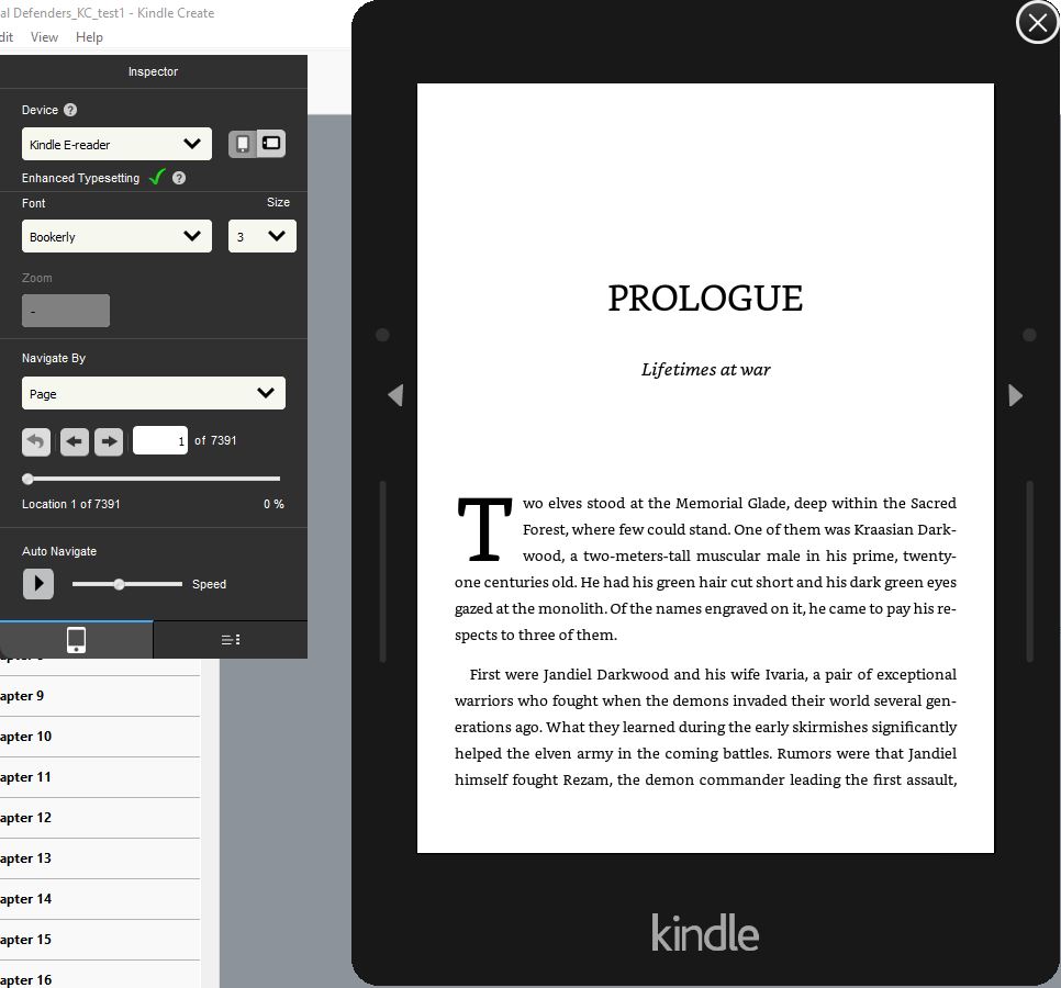
- Built-in previewer for Kindle, tablet, and Kindle phone app
- Print file support
I think the fact KC uses smart hyphenation from the moment you import the source file is a good point as you can use it to scroll through and see if there are any words with weird results – though I’m not sure if there any ways to remedy them.
KC also shows you what it considers front and end matter (and if you use its tools, it’ll put prologue into front matter and epilogue into end matter – do not do this!!!) – which sets what is considered point 0% and point 100%. This allows the reader to open the book after the front matter and pops up the ‘rate and review’ screen at 100% – this is why not to put the prologue into the front matter – the reader would auto-skip it. This is one of the aspects hard to hand-code.
KC also has a handy tool for drop cap – used for the first paragraph in chapter, if you choose to.
Cons:
- Limited options
- Export file can’t be loaded by a Kindle device/app
- Some changes aren’t intuitive (at least not at first)
KC has four basic templates, which allow only limited customization. One thing that is troublesome to adjust is Table of Contents if you use number + title. You can pretty much choose between sacrificing one for another, while hand-coding would give you some ways to bypass this.
The file KC spits out is *.kpf – a file that’s readable only by Amazon’s book upload interface. Which means you have to put your faith in the previewer and can’t test the result on your Kindle device/app which can’t read the *.kpf file. This is a major drawback for me.
The formatting is limited to 9 groups (of which some, like chapter headers or separator, have very clear purpose) – while hand-coding would allow you to do anything you wish, provided you have the necessary skills and knowledge.
A short how-to
When you start KC and create a new project, you’ll start with importing the source file. KC will then do a structure detection and show a chapter list – if this doesn’t seem to work then you should go back to your source file and make sure to use Heading1 for chapter titles.
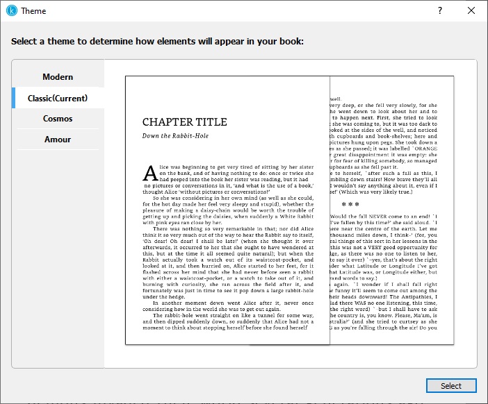
You can then choose from the 4 basic themes (with a sample text shown). You can switch between them on the go. The main difference is in font style for chapter headers and scene breaks.
After that, you can play with the content. If you want to use drop cap for the first paragraph in each chapter, you’ll have to individually mark each such paragraph. The major work is probably marking chapter titles and subtitles.
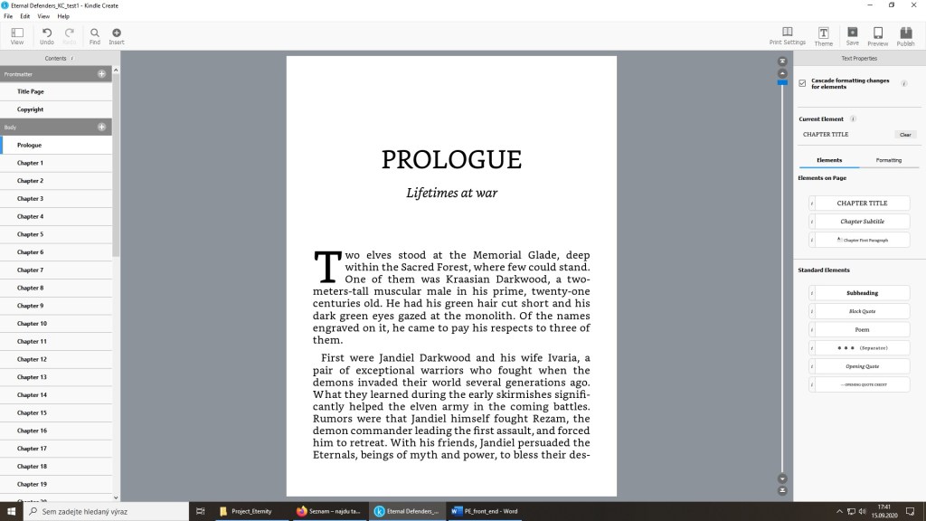
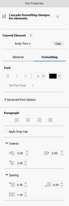
As you can see on the screenshot above, you have access to exactly 9 styles, of which most have pretty clear functions. However, the space for creativity is the book itself, not the formatting, so this will get the work done for a majority of writers, I believe. And the minimalistic options for adjusting the formatting are related to spacing and font size.
As said above, you can preview the result anytime and the previewer has size-based presents for phone, tablet, and Kindle e-reader in both portrait and landscape mode, defaulting to tablet for some weird reason.
As said, the main issue I have with KC is in the auto-generated ToC.

Given the screenshot above, Chapter title is simply the number 1 – and that’s what is put into the ToC. I’ll definitely give it a while and see if I can find a way to adjust this but if I was doing the HTML hand-coding approach, I could just add an invisible line that’d combine the chapter number and chapter title, and feed that into ToC so it’d be ‘Chapter 1: Frozen dream’ instead of just ‘1’.
Amazon’s KDP help section has a detailed guide to Kindle Create (see the link at the beginning), so this short rundown should only give you an idea what it can (or can’t) do and help you decide if you’ll give it a try. As the software is free, I think it can’t hurt to try – and if you need something more advanced, then look for it.
I’ll return to this topic sooner or later and share the +/- of hand-coding. For now, feel free to ask me anything on the topic. I’ll do my best to answer even though my experience with KC is, so far, limited to my own quick test.

Reblogged this on Ethereal Seals and commented:
When it comes to publishing our work online, the options can seem confusing and overhwhelming. Here’s a helpful article on Kindle Create from a fellow blogger. KC is a tool to publish your work online with some easy-to-use features.
LikeLike
Pingback: DYI HTML e-book formatting | Tomas - the wandering dreamer
I’m finding that the “cascade formatting changes” doesn’t work for the body text, which is a pain as I had to manually apply ragged right to paragraphs a page at a time. My book was only 971 locations long (40-ish pages?) so it was only mildly tedious, but for longer books… not fun.
LikeLike
An advantage of HTML over KC. If you want to get your book just a bit more customized, KC will be troublesome.
LikeLike
I will say I do like the KC separators. Question, If you use HTML (do you upload HTML to KDP or run it through something else?) can you use Unicode or 🔷 to insert something like the diamond dingbat separator in the KC classic theme?
The other issue I’m seeing is that the “editor” and the Preview in KC don’t give the same results, which was frustrating. (the line spacing on the First Paragraph element vs the body text element — looked the same in the editor. but in the preview the body text was looser, and Advanced Settings showed that it had a different setting! Which… if changed, did not cascade….)
(I’m thinking I’m just going to go back to using my old 1.9 of Scrivener to make epubs, and just accept that my books won’t have drop caps, or be ragged right by default.)
LikeLike
You can do a lot with HTML. You can use a small image for a fancy scene breaker and the separator would be a link to the image (so it’s only once in the file) I think that’s how most of the fancy curly scene-breakers are done in HTML.
Drop caps are quite a tricky in HTML and I gave up on them – I don’t see a major benefit in them. They can be done either by quite a complex CSS, or by having the drop cap inserted as an image.
LikeLike
Pingback: Creative anniversary | Tomas - the wandering dreamer